New Identity, worldwide, adaptable and sustainable.
THE INCREASING VALUE OF REAL BETIS IS REFLECTED ON ITS OWN BRAND.
We are going to create a new visual
identity updated
for today’s world without
losing our essence.
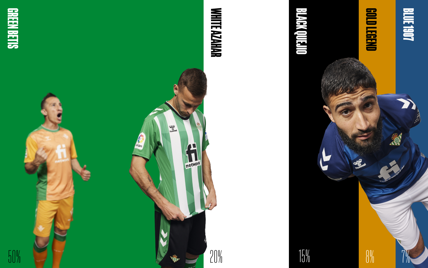
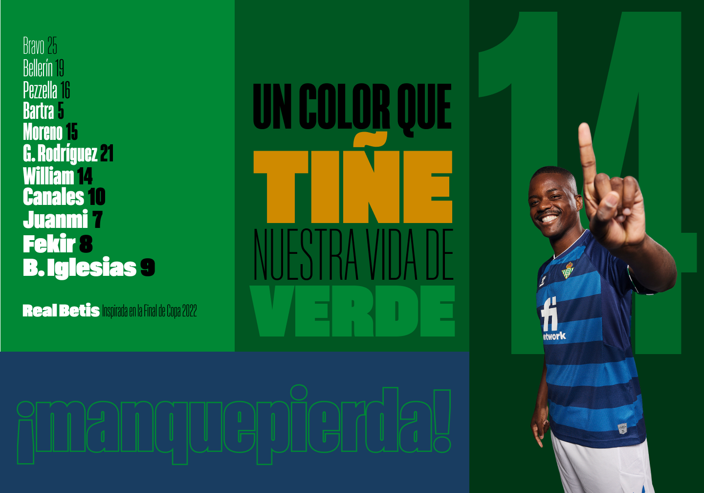
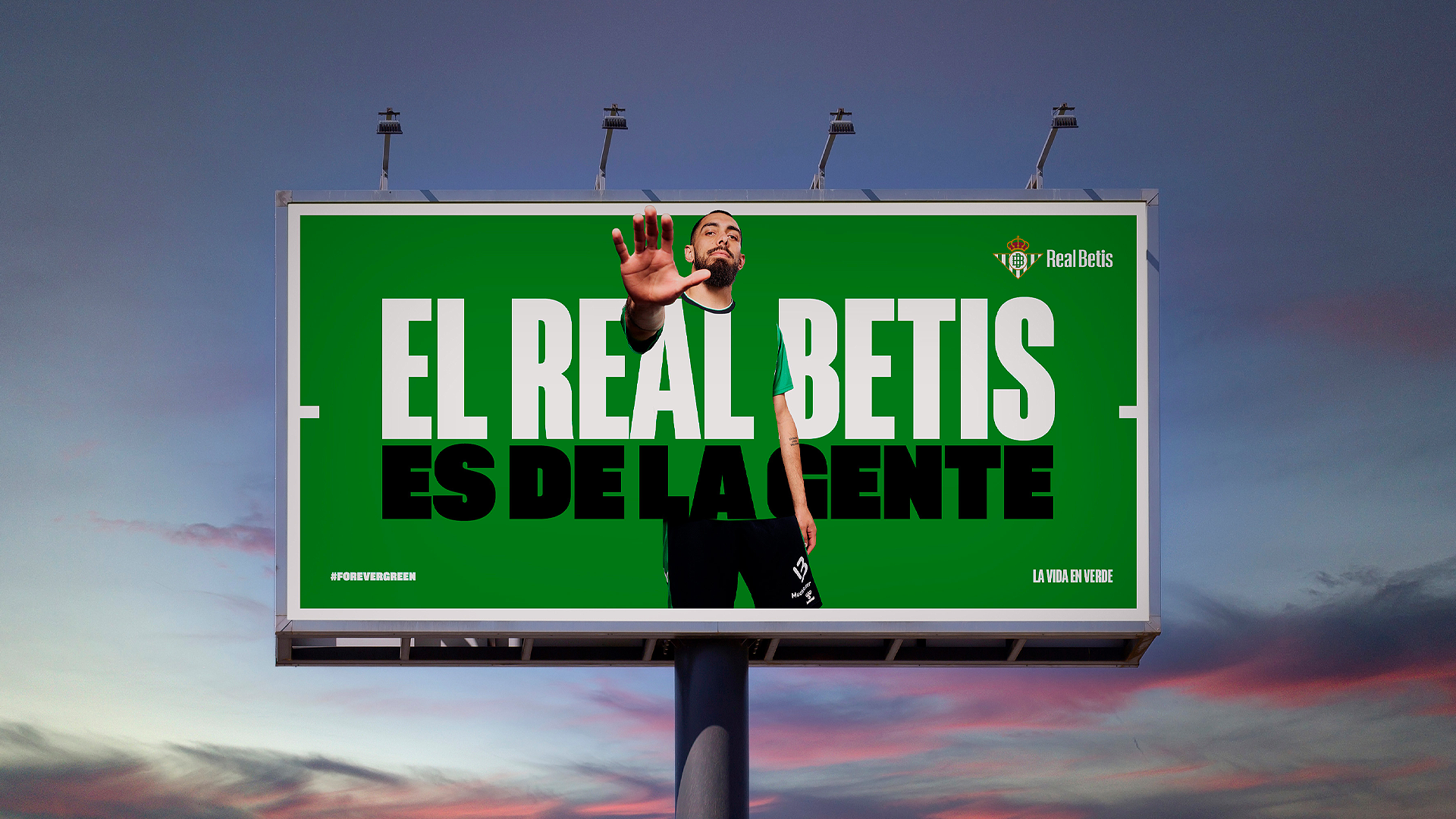
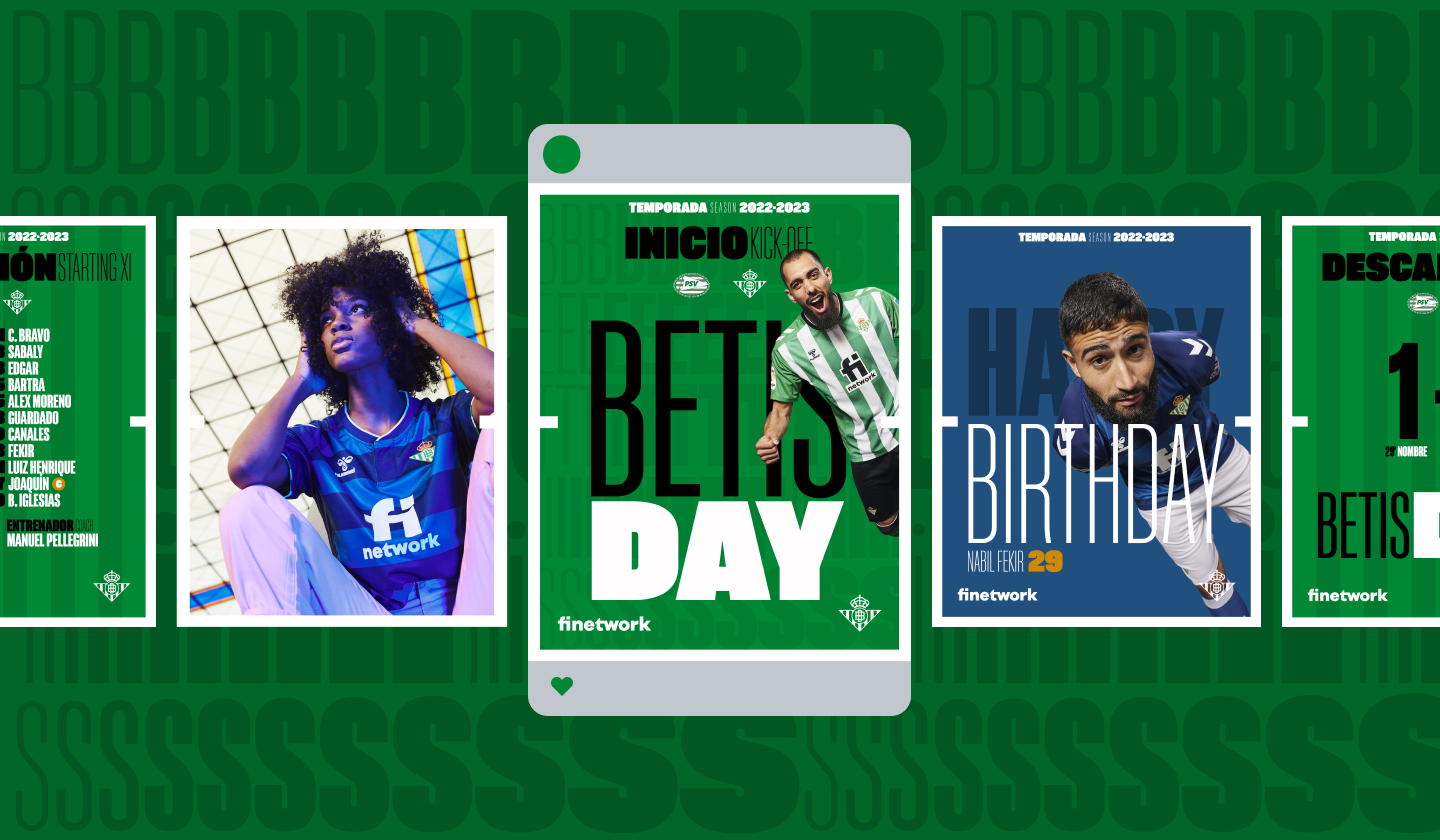
Our brand represents a way of understanding life in green,
with our fans always in mind. The goal is to project an identity that ensures visibility, readability and
coherence, a wide visual language, with new elements and a strong personality that allows the brand to evolve in time.
A more flexible design that can be adapted to all environments and all the audiences that interact with our club.
These are the main elements that create our new visual universe:
A Brand inspired by the personality of its people
We have a unique fan base.Unbeatable. Our idiosyncrasy, our values, our way of living, and feeling in
Green and White for more than 100 years, even in the toughest times, have turned us into a club with
its own identity features. A legend that goes all over the world. And that is exactly what we want, to
reach every corner of the world.
History and future go together in our identity. The crest does not change. It maintains its basic shape,
but some corrections are applied to unify and extend its use in all our sub-brands and business areas.
Simple strokes on the crown and on the double B to optimise and adapt the crest to smaller formats, such
as using it on an online avatar
The crest is created with a new font, another sign of the coherence and unification of the rebranding.
Colours that represent our passion
The green of the pitch at our stadium.
The green hope that runs through the stands at the Villamarin in the 90th minute.
The green that hangs from the balconies of Seville and its surroundings.
The green of Andalucía and the ninth province.
The green of the sustainability of the club and its commitment with the environment.
The white of our city in the morning.
The black of the dark night.
The yellow of the legend that goes over the entire world.
Blue, since 1907, the first color of our emblem.
A passion goes beyond this life.
It is forever. Infinite. A legacy that is inherited.
That is offered to those who arrive by of those who left.
And it’s summed up in colors that highlight our life.
Bético color palette prioritises the use of green in all communications and,
in addition, it is adjusted for digital environments and allows accessibility in each component.
A font with attitude and a lot of style
We have created an original and exclusive font for our Club.
Inspired by the starting eleven who won the Copa del Rey, a robust typographic
family, with its own personalityAt the same time, sans black type, urban, closer to the language of
our fans around the world. It is complemented with styles for basic characters, being a versatile
communication element and with infinite compositions.
We work hand in hand with Eduardo Manso due to his long career and experience in the world of fonts.
From the very beginning, he managed to perfectly capture the projection of the Club and to define
a bold, courageous font family, with a lot of personality and unique style.
What goes on the pitch and beyond
The playing pitches of our city, of our country and our world are Green and White.
That is where our goals are achieved and our dreams are fulfilled.
For the Club’s global communication, we have built a flexible layout that can be used entirely with images or text.
The content will be the priority. And, on the inside, the layout its divided in different parts, focusing on the message we want to transmit.
Field zone is designed to define different layout variants and thus adapt to all possible supports and scenarios.